Logo Design & Brand Identity for Serva Terra
Serva Terra is the “Mother” company of three commercial printing brands. I was tasked with designing the logo and developing their brand identity.
Sustainability and respect for the planet are the core values of Serva Terra. They primarily purvey business marketing materials printed on recycled content paper with animal-friendly vegan inks.
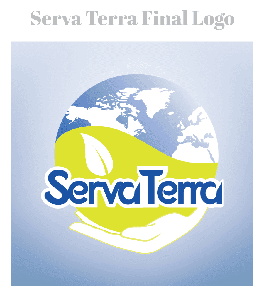
The client had specifically asked for these symbols to be integrated into the logo: Hands holding the earth to symbolize respect for the planet and a leaf that would represent the conservation of natural resources.
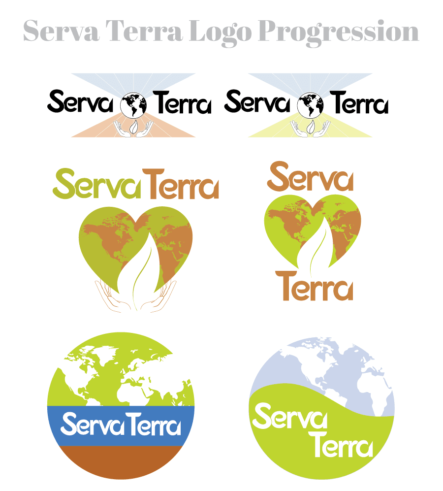
With this in mind, my objective was to develop a brand that conveys this message of environmental consciousness. There were several iterations of the logo before the client approved the final version.


Serva Terra Website
The website incorporates a dynamic aesthetic representative of Serva Terra’s mission by utilizing imagery of the natural world which Serva Terra is committed to protecting.

Serva Terra’s brand identity was designed with a deep understanding of the company’s values. This identity goes beyond aesthetics; it’s a visual representation of the company’s commitment to a greener future, a message that resonates with environmentally conscious businesses ready to embrace a more sustainable path.
